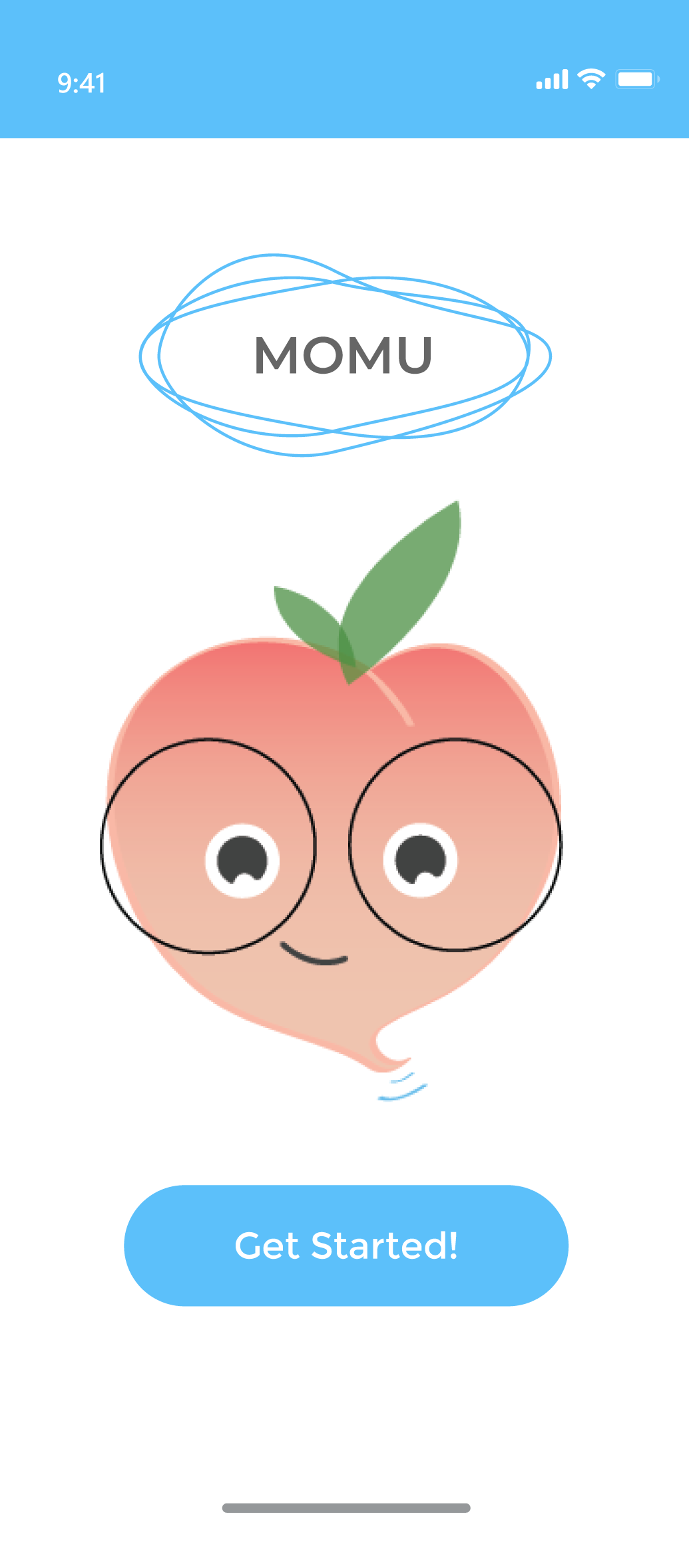
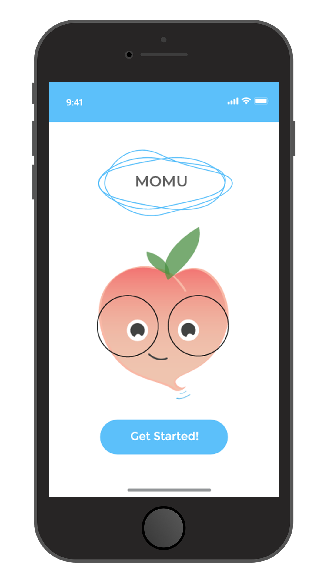
Momu.
Study app that addresses problems students’ face with their study habits.
Study app that addresses problems students’ face with their study habits.
Management of the project as the Team Leader.
How can we design an application that will improve student study habits?
Contextual Inquiry was conducted to get to know the intended users of the app. The following methods were used to collect information from potential users to aid in the formation of the conceptual model.
The information gathered during the contextual inquiry set a foundation for the design of the application. There were 19 responses to the online survey and seven interviews conducted of students at the university and close acquaintances. Some key statistical insights regarding motivation to use the app included:
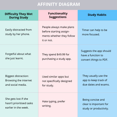
To help organise the insights particularly from the interviews card sorting was conducted. The results from the card sorting were re-organised again using affinity diagrams and were classified based on their themes.
Below is a summarised example of the affinity diagram my team and I created.
Social media and internet are the main distractions from studying.
Convenience and time saving are important for note taking.

Simplicity is the key for the interface.
Users feel a need for task prioritisation and planning.

Rewards enhance user motivation.

Users have difficulty remembering what they have just learned.
Once the insights were identified, they led to the creation of system requirements, specifications, and conceptual designs. The conceptual design consisted of a one-sentence problem statement, a high-level description of how the system worked, an interaction paradigm, an interaction mode, and key interface metaphors.
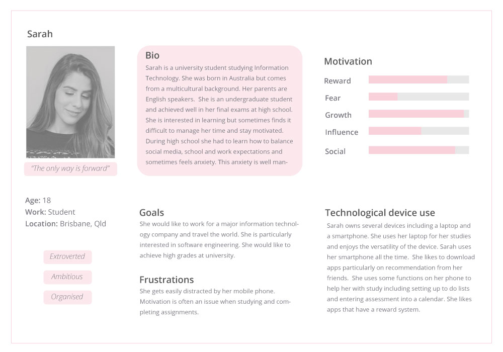
This persona was established based on qualitative research conducted through interviews. It represents a student who is familiar using apps to help her study and would be a typical user of the application.
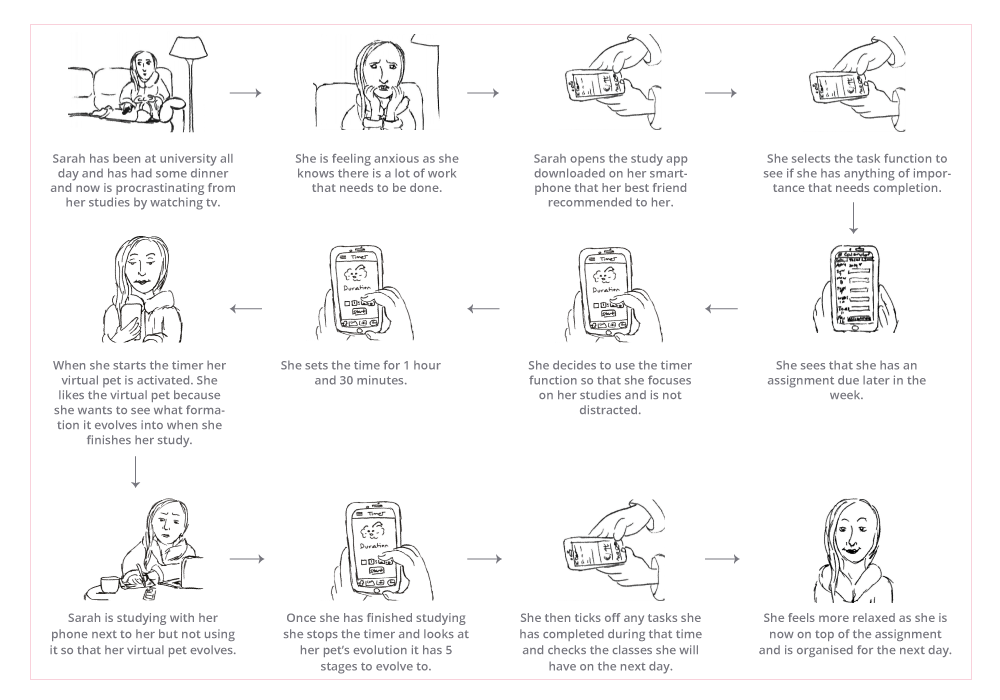
Creating a scenario assisted visualising how a potential user may interact and recognise potential issues.
Sarah has been procrastinating from studying after dinner.
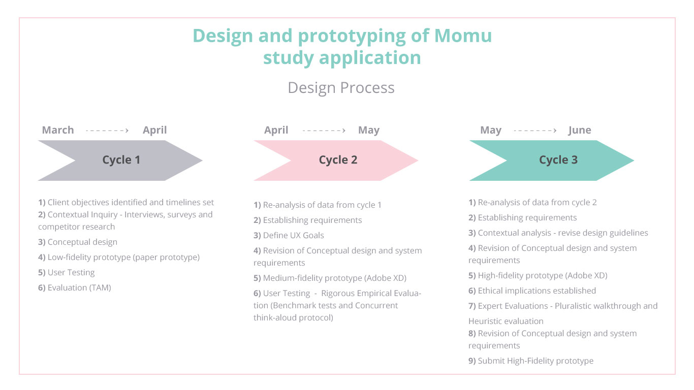
After conducting the research, empathising with the users needs and experience and identifying insights, a low-fidelity paper prototype was created. The prototype was then tested and documented using a specified task list with five participants following with a questionnaire. In order to understand people’s overall impression and identify the potential issues a TAM test was also conducted to guage the usability of the system.
The participants gave valuable feedback including:
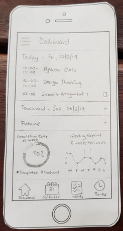
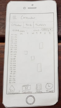
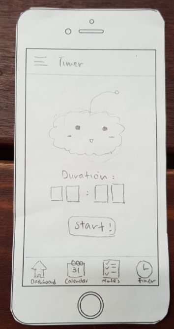
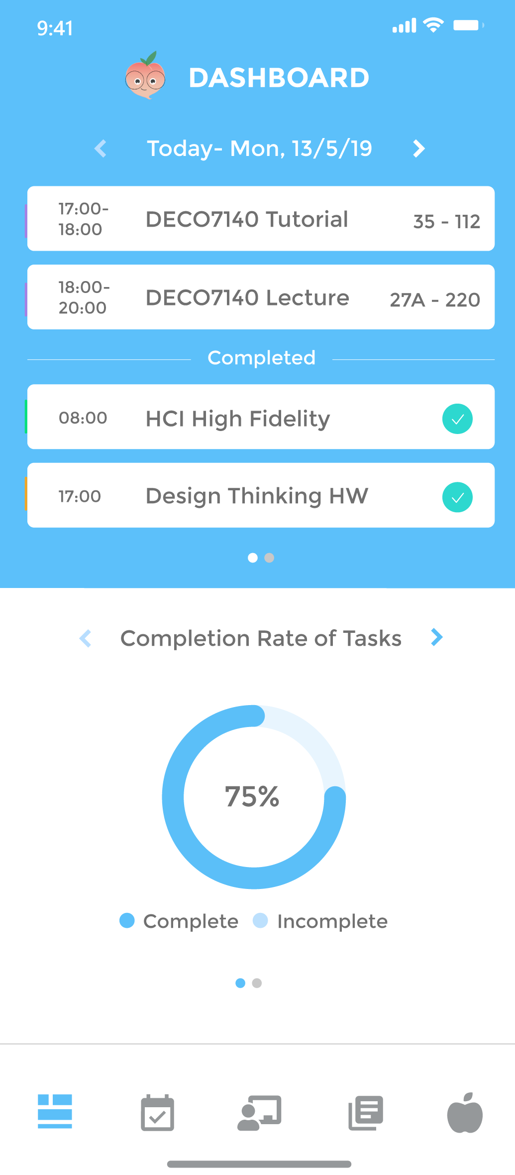
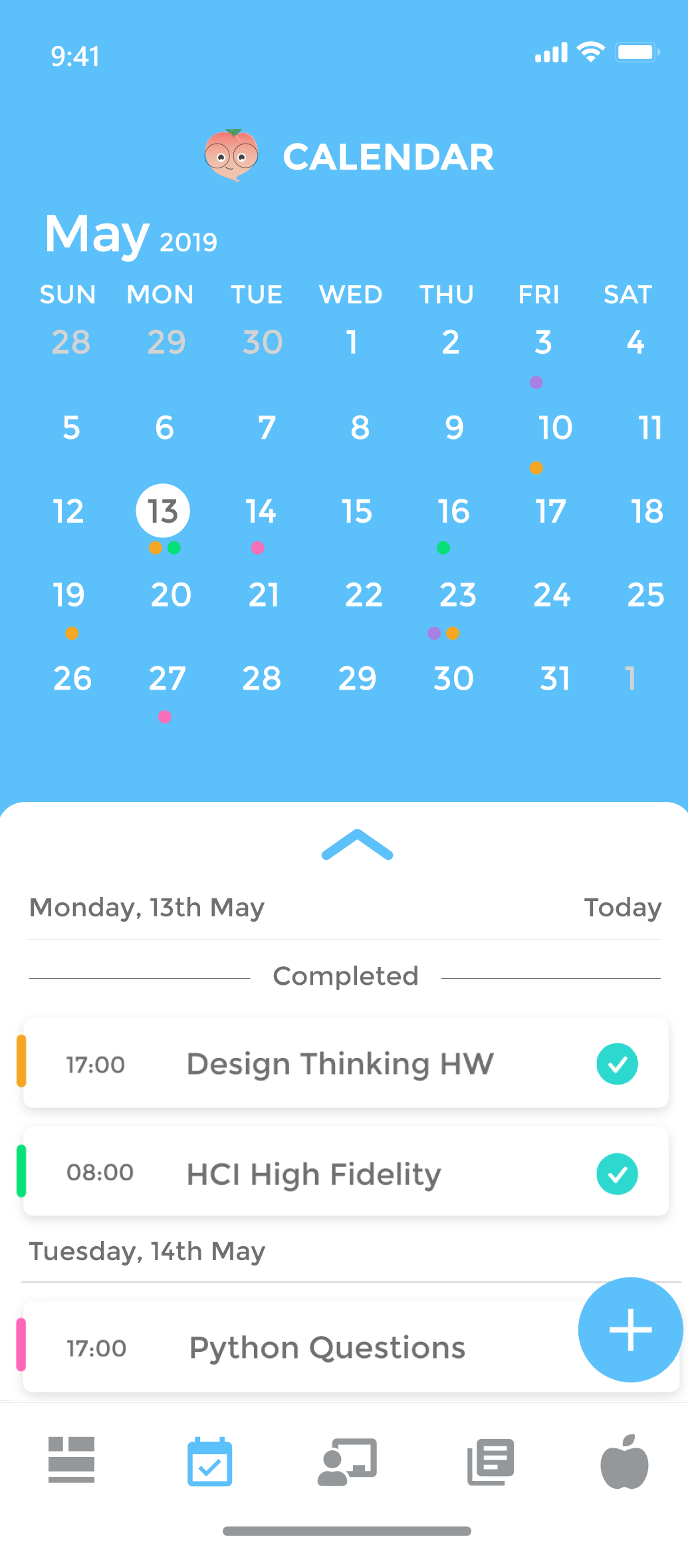
The wireframes were created using Adobe XD after the paper prototyping was completed in cycle 1.
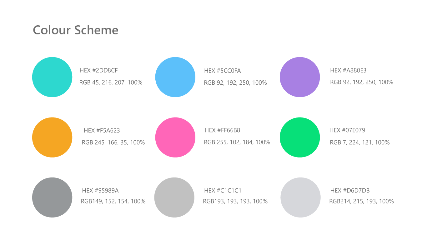
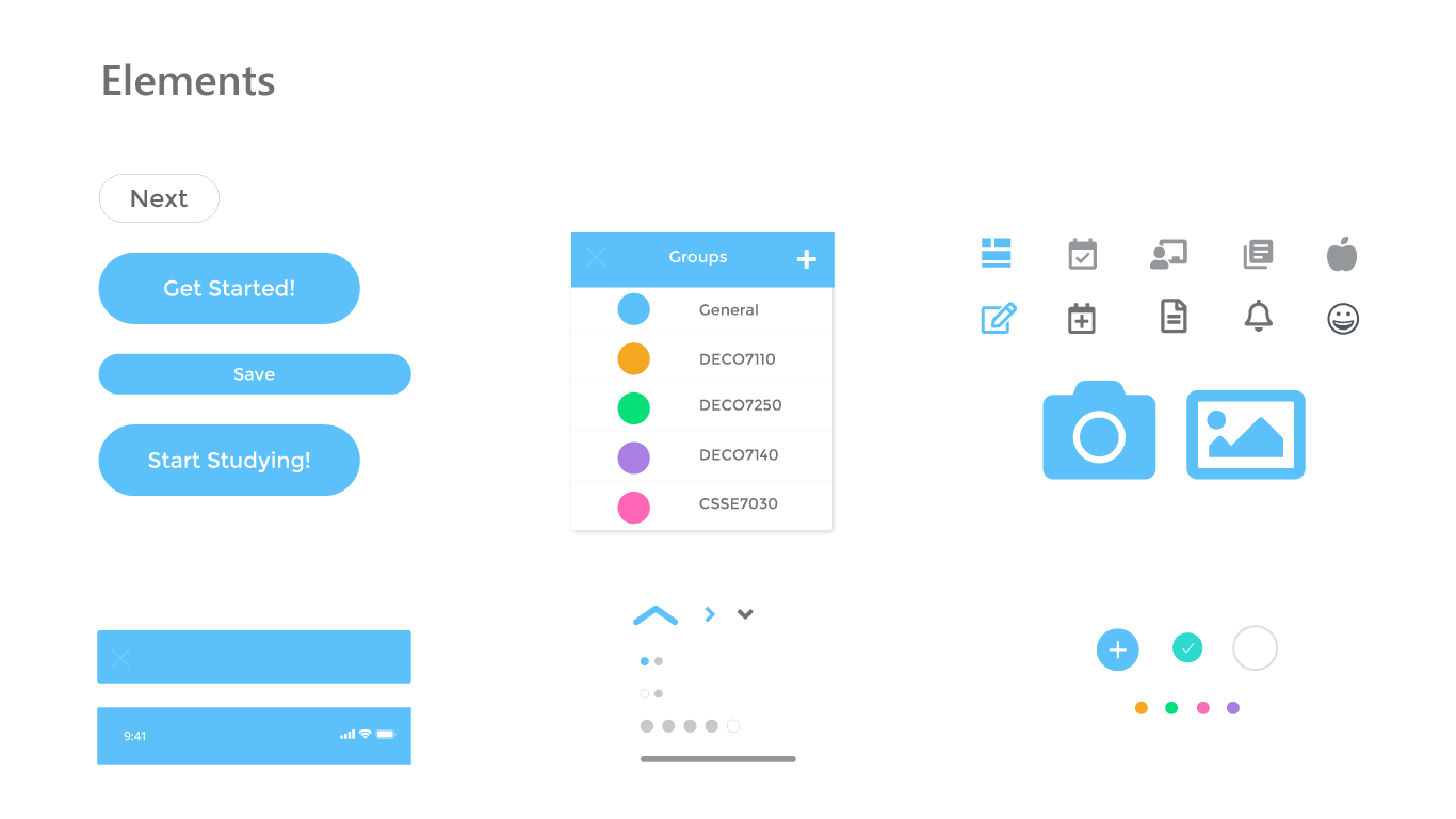
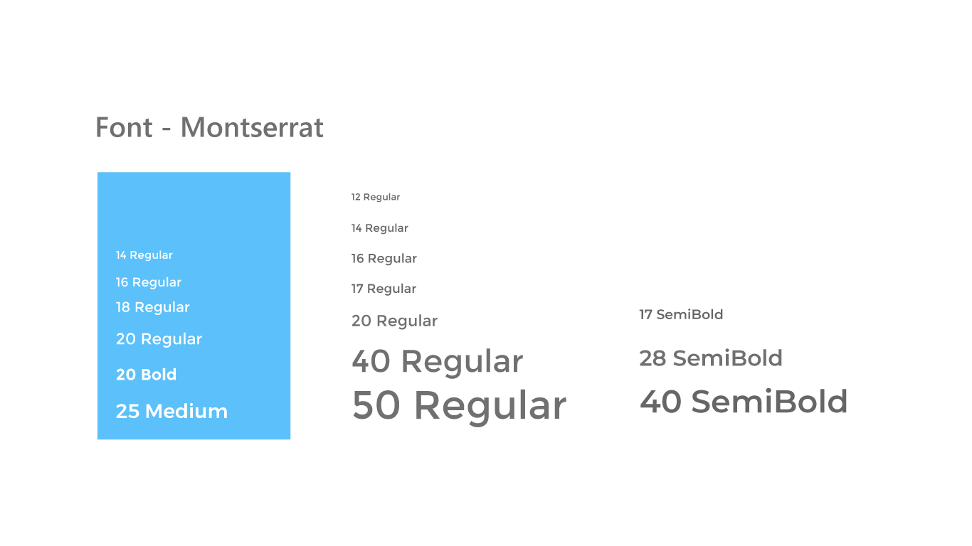
Software – Adobe XD, Illustrator and Photoshop.
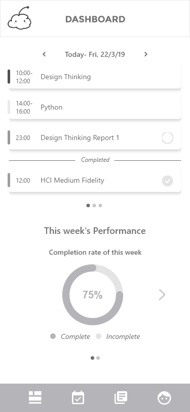
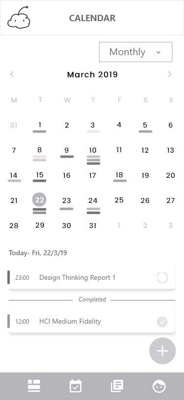
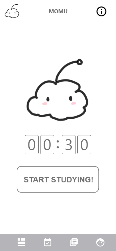
Based on user research the visual design needed to be clear, consistent and simple. Research indicated that buttons were too small in previous iterations so they were altered to be bigger. Users indicated that categories needed to be colour coded so this was altered to enhance consistency.
Software – Adobe XD
This project was an excellent experience to learn how to design following the UX lifecycle template in a design team responding to a brief. It provided comprehensive understanding of iteration cycles to advance from paper prototyping to a functional high-fidelity prototype. Being a university project, it was also a great opportunity to apply theoretical understanding to the processes followed and justify why they were undertaken. I found that understanding the theory of Human Computer Interaction enabled a deeper appreciation on how humans interact with technology.
During this project I learned to organise and manage a team to meet weekly sprints so that the tight deadlines could be met. I found the testing periods to be extremely beneficial to collect qualitative and quantitative data to justify the decisions made at each iteration. To improve the application, I would have liked to do another iteration phase to respond to the feedback obtained from the pluralistic walkthrough and heuristic evaluation.
The High-fidelity prototype was a great achievement after four months of hard work and fast learning. The team was proud of the final product as it responded to the brief and was focused on improving the experience for the users based on real data. The project provided a comprehensive understanding of the complexity of creating a prototype that seeks to solve a problem to improve people’s lives, in this case the study habits of students.