Daily UI.
August 2020 - Ongoing
I have embarked on the Daily UI Challenge and as I learn, research, create and apply good practice my portfolio will be updated as a living project.
I have embarked on the Daily UI Challenge and as I learn, research, create and apply good practice my portfolio will be updated as a living project.
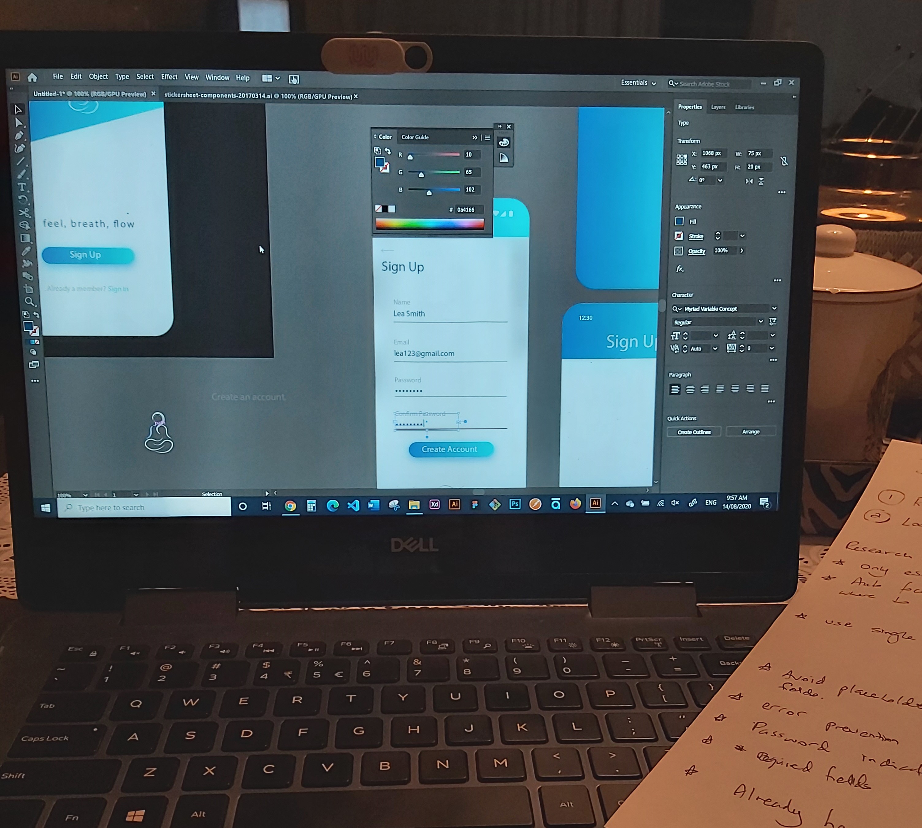
Materials/Software – Basic pen and paper and Illustrator.
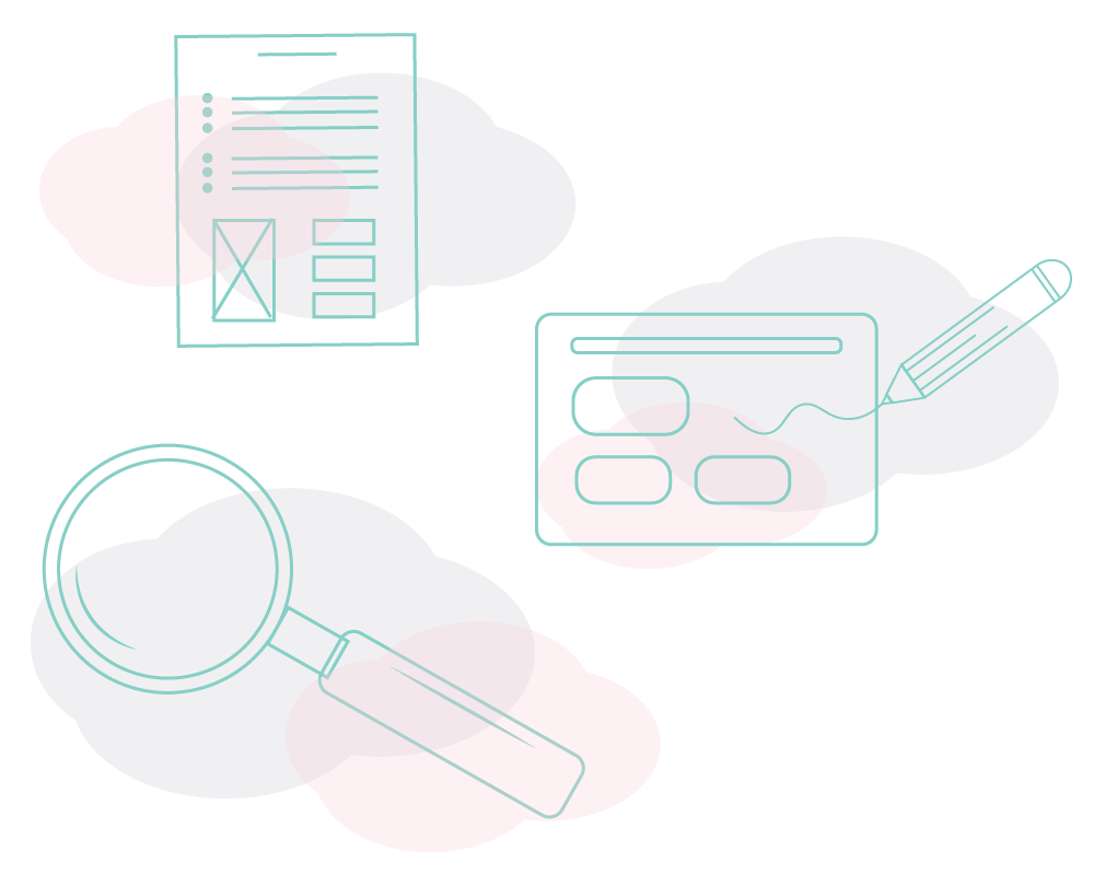
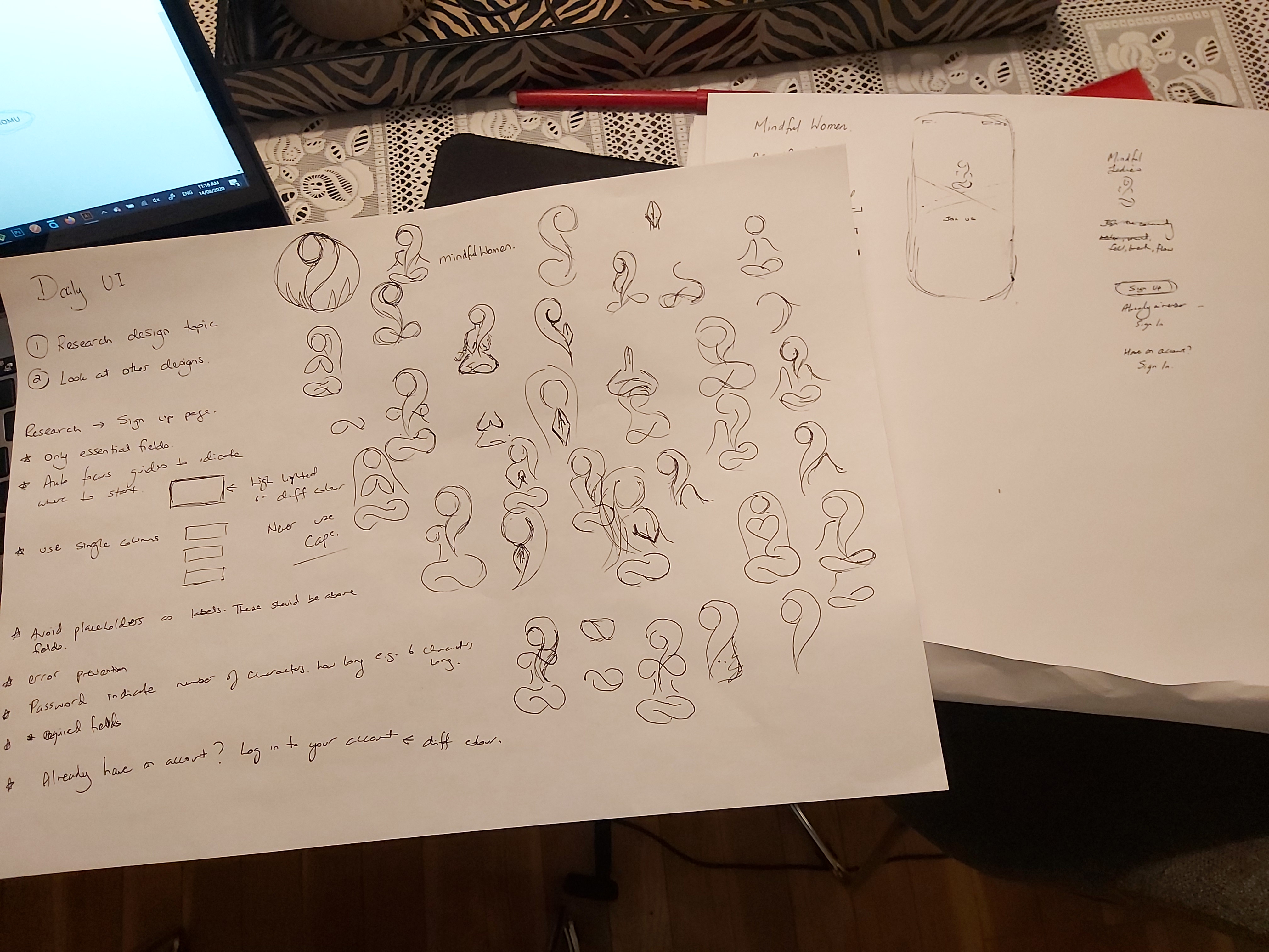
To design and create the sign up page I followed a number of steps to start the creative process.
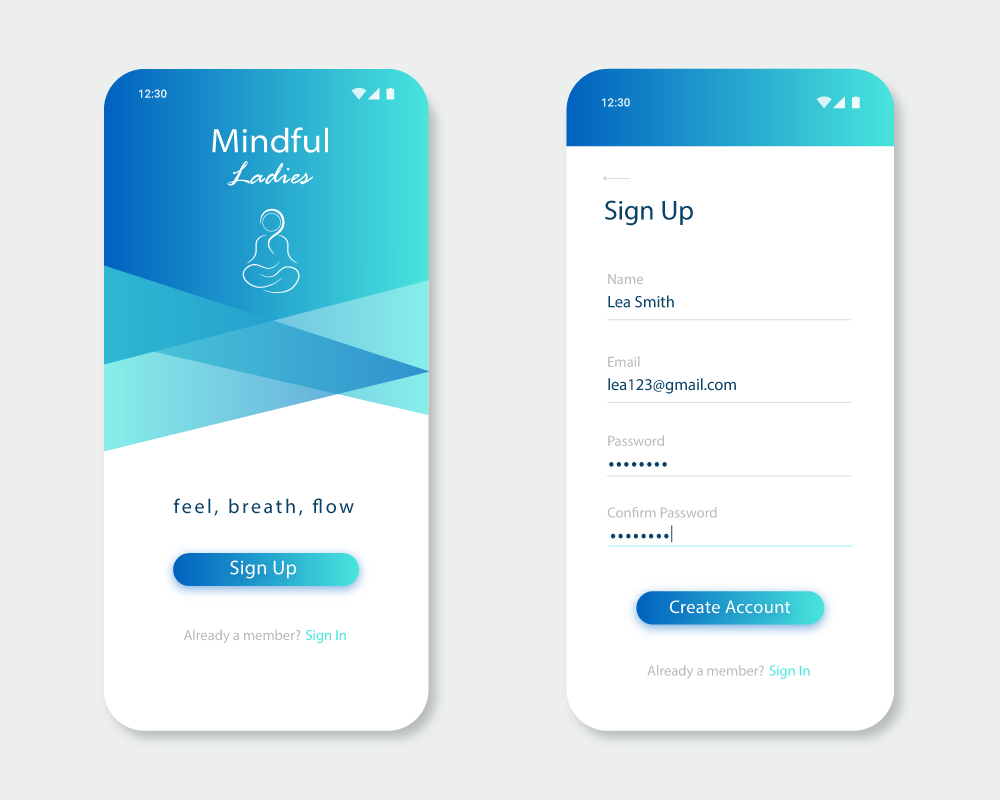
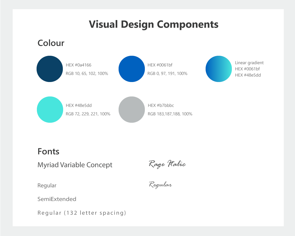
I decided to create a sign up page for the theme of mindfulness for women. The application is called Mindful Ladies. I designed an image of a lady in a meditation pose using curved lines like waves and I wanted tranquil colours that were inspired by ocean colours from my recent trips to the beach.
This project was quite interesting as it prompted me to learn not only about the UI involved in creating a sign up form but also the user experience and accessibility. Some key learnings were:
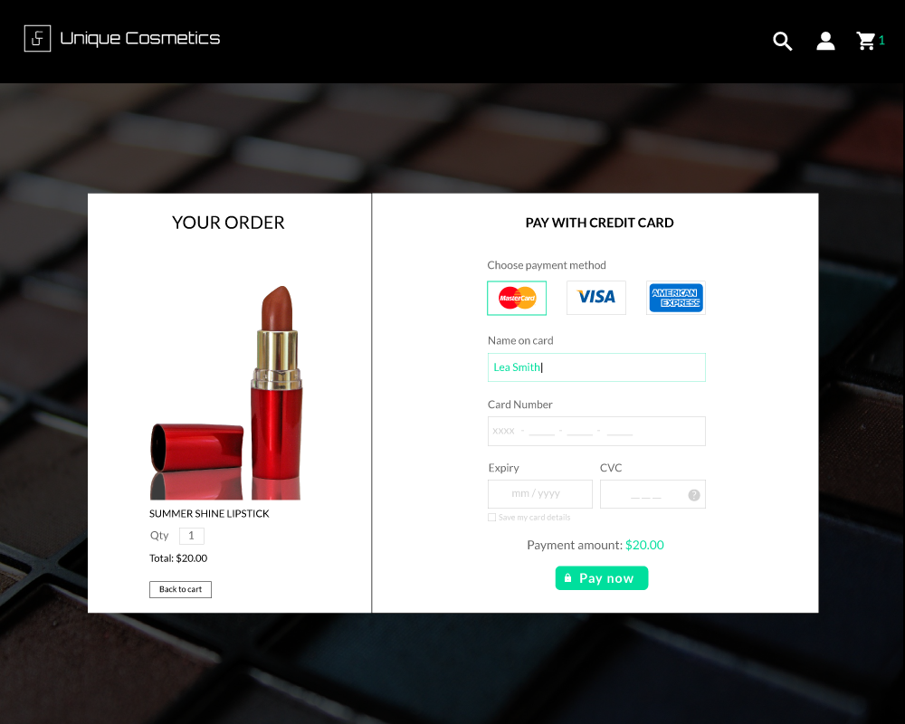
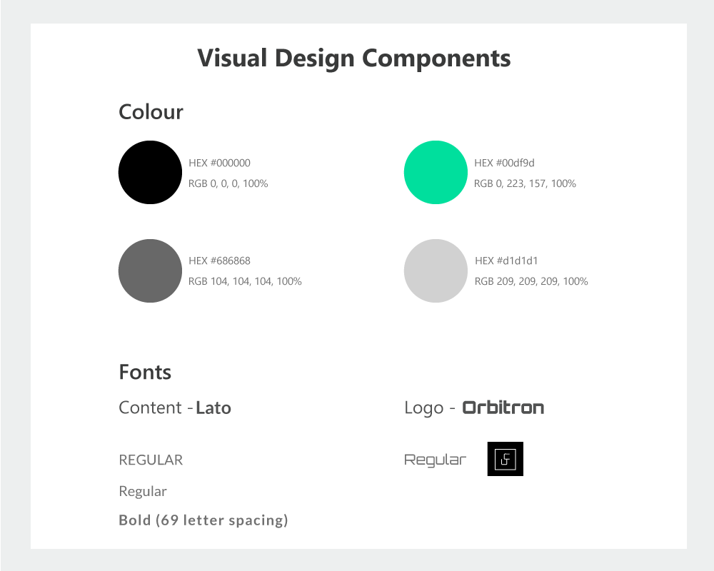
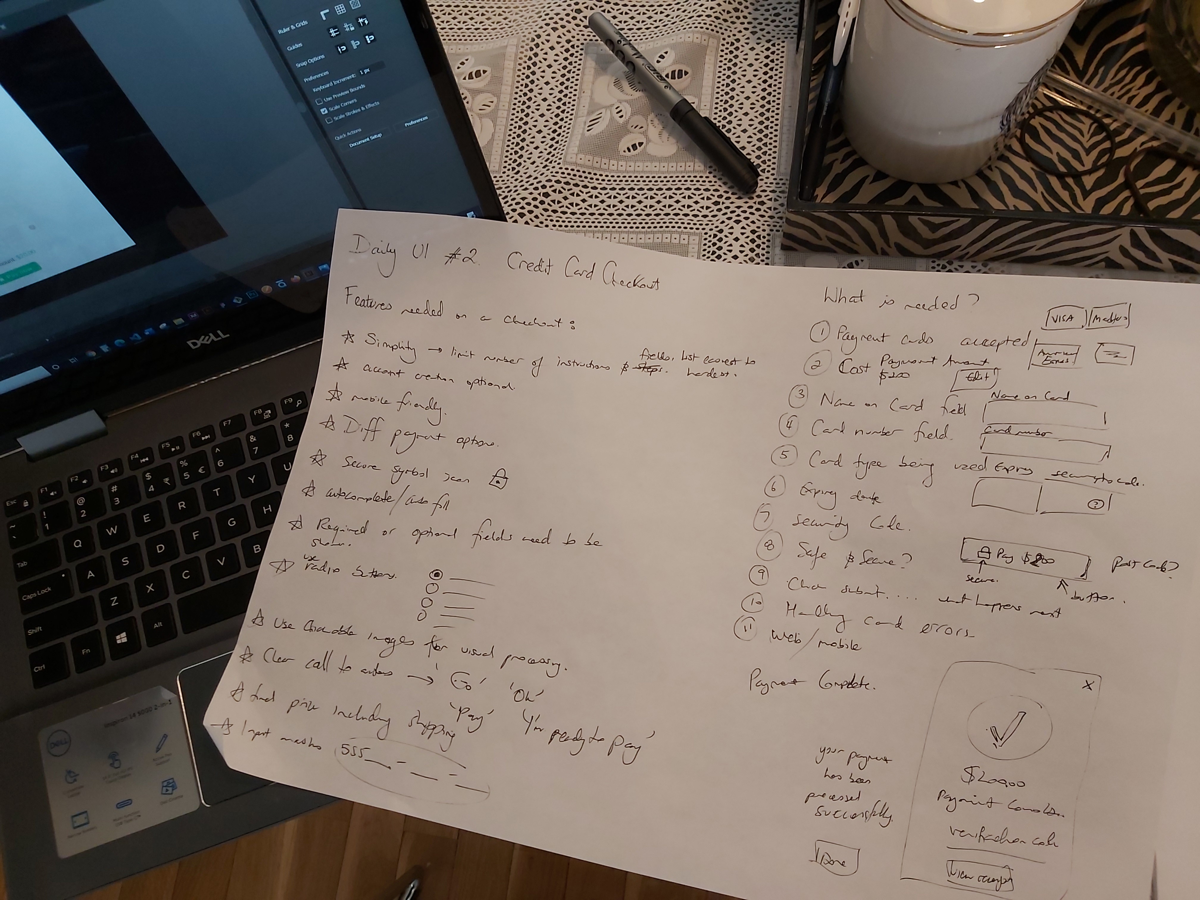
Materials/Software – Basic pen and paper, Illustrator and Photoshop.
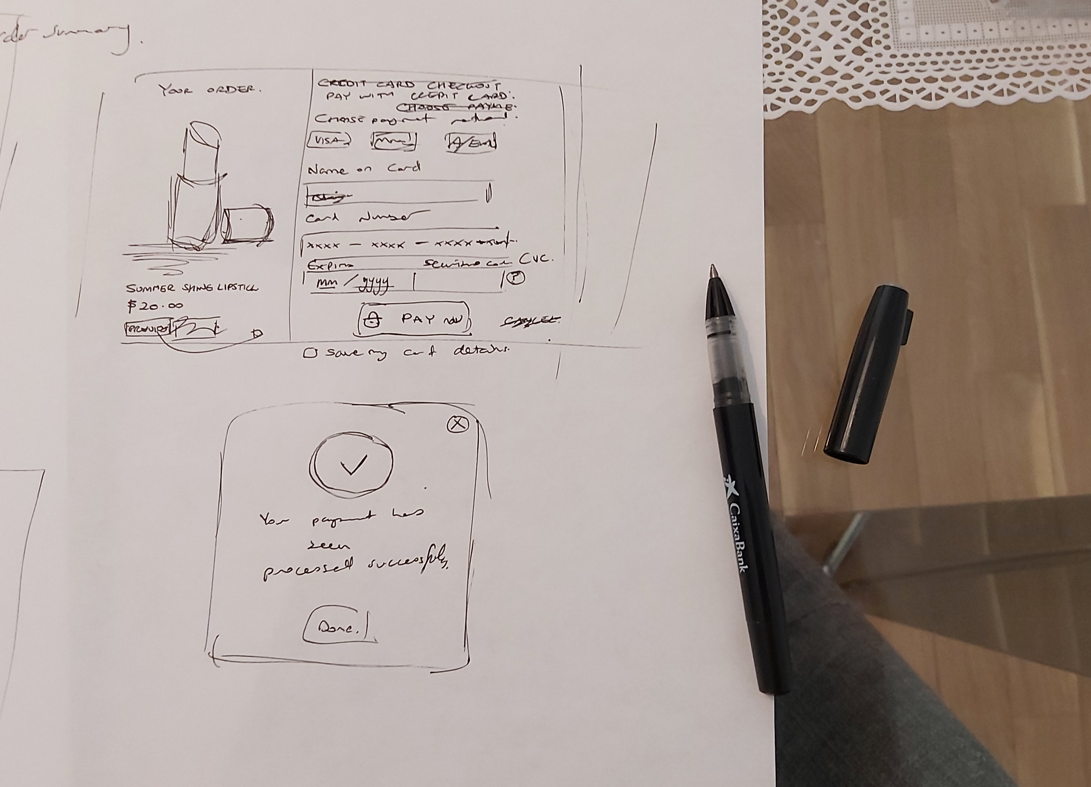
To design and create the credit card checkout the process included:
I decided to create a credit card checkout for a cosmetic company. The website is called Unique Cosmetics and I designed the logo using the first letters of the company name 'U and C'. I wanted the design to be modern, simplistic, slick and stylish.
I learned quite a lot from this project as to ensure consumers trust and feel safe to buy online the designer needs to build this trust by using good practice UI principles. Some of the things I learned included:
Materials/Software – Basic pen and paper, Illustrator and Photoshop.
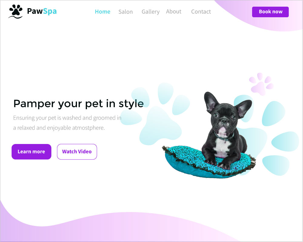
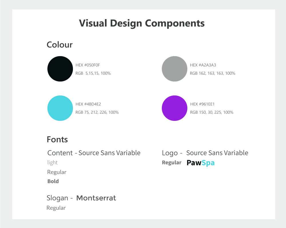
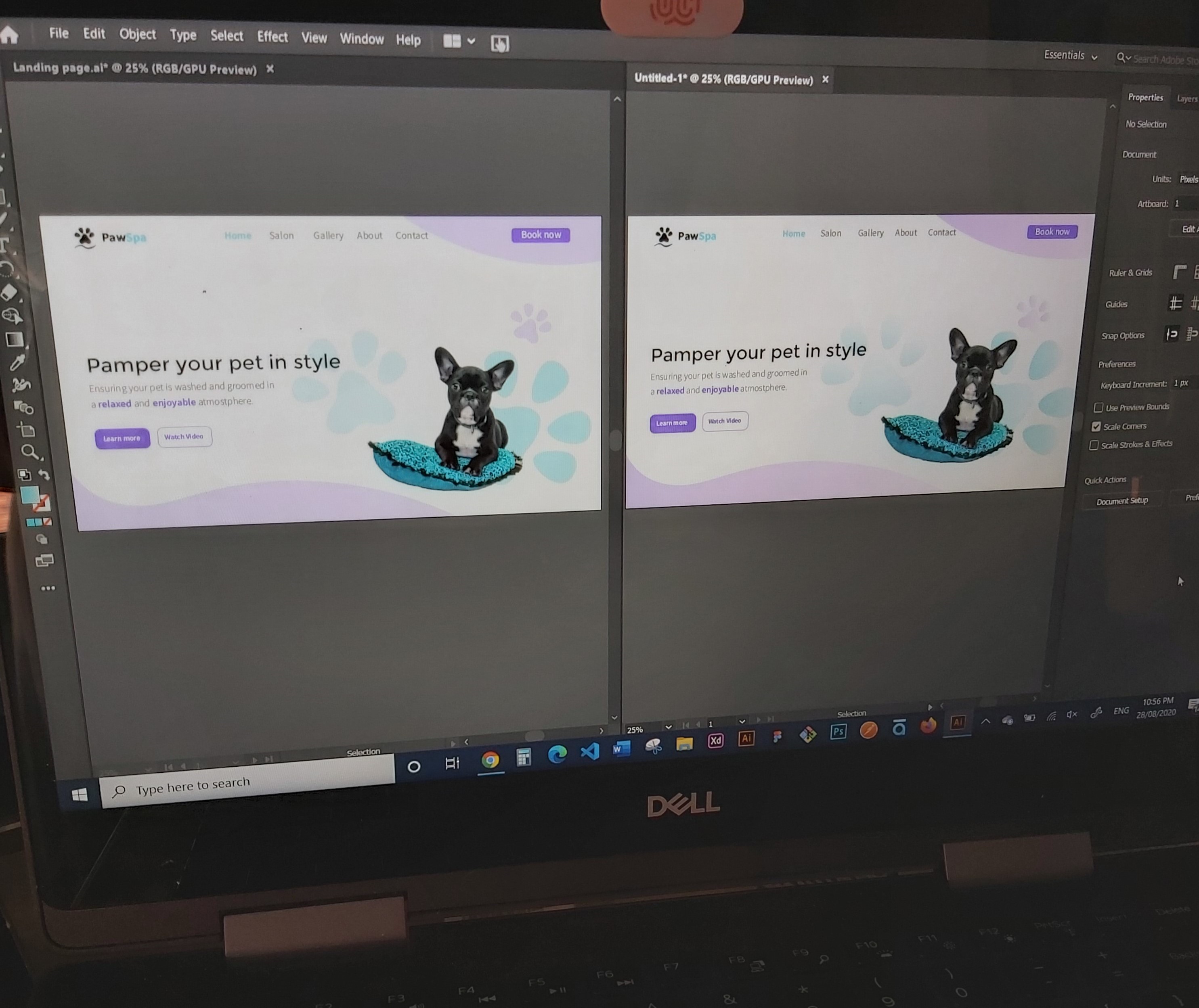
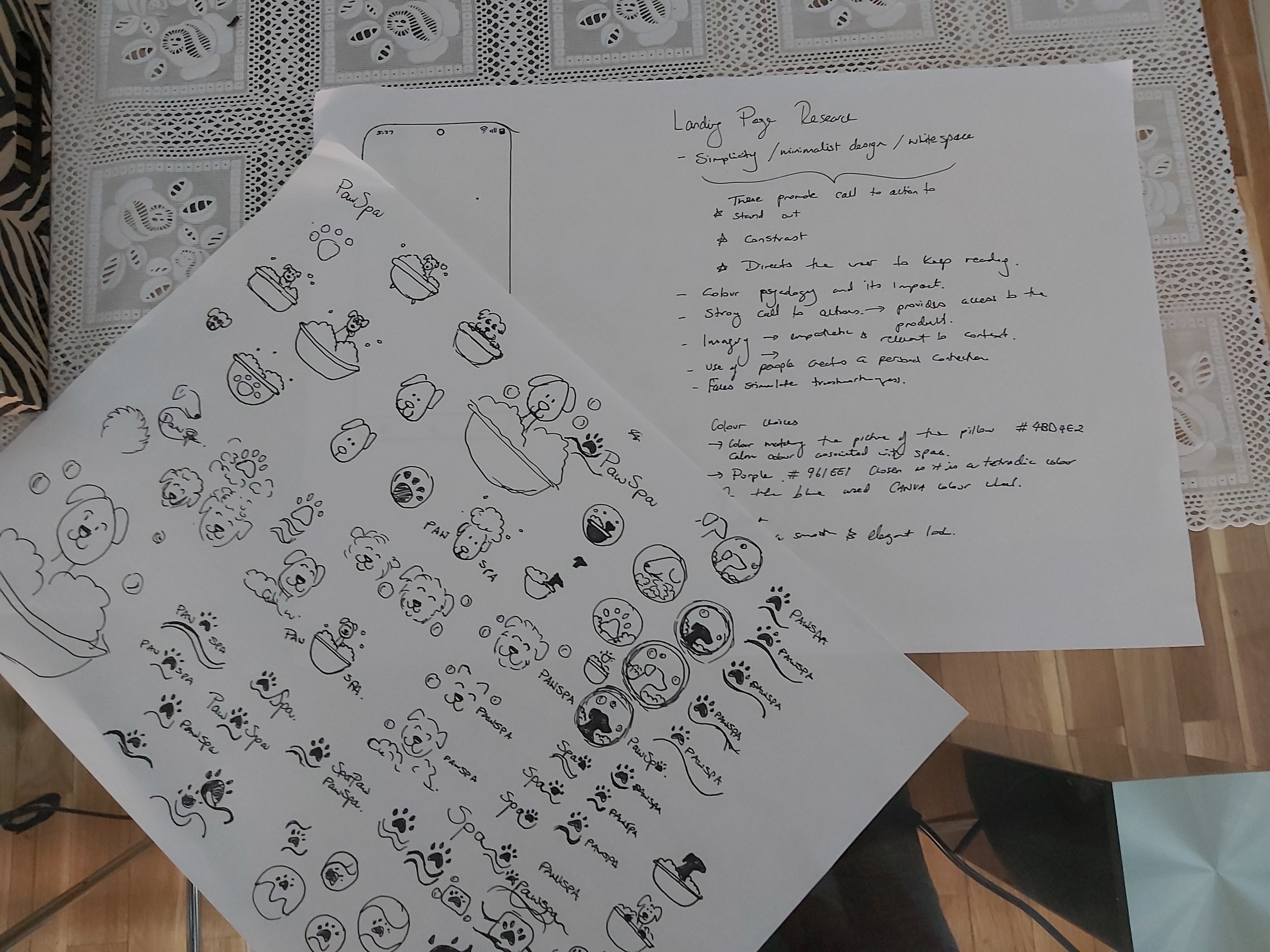
To design and create the Landing Page the process included:
I decided to create a landing page for a pet grooming and washing buisness. I decided on this theme as my sister has been walking dogs and grooming them for people as a hobby. The website is called PawSpa and to design the logo I sketched many ideas relating to dogs, bathtubs, bubbles and soap. I didn't think any of the initial designs were appropriate for a logo so I decided to go for a simplistic approach and focus on the key words of the buisness PAW and SPA. I decided to create a Paw icon and combine it with a wave to create a minimal logo design.
Although landing pages do not seem to have a complex structure I learned that getting it right despite this fact is not that easy to achieve. A landing page needs to grab the attention of the target audience and for buisnesses this is the first impression clients will make. The following are the main take aways from my research: