The Gideon Richard Project.
Design of a professional website for The Gideon Richard Project, a company based in London specialising in property investment.
Design of a professional website for The Gideon Richard Project, a company based in London specialising in property investment.
How can I design a property investment website that is modern, professional and evokes a sense of trust?
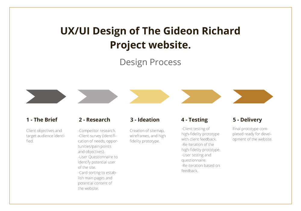
The client did not have an existing website, so the website needed to be created from scratch. The contextual inquiry was conducted to get to know the intended users of the website and to better understand the company's objectives. The following methods were used to collect information:
The information gathered during the contextual inquiry set a foundation for the design of the website.
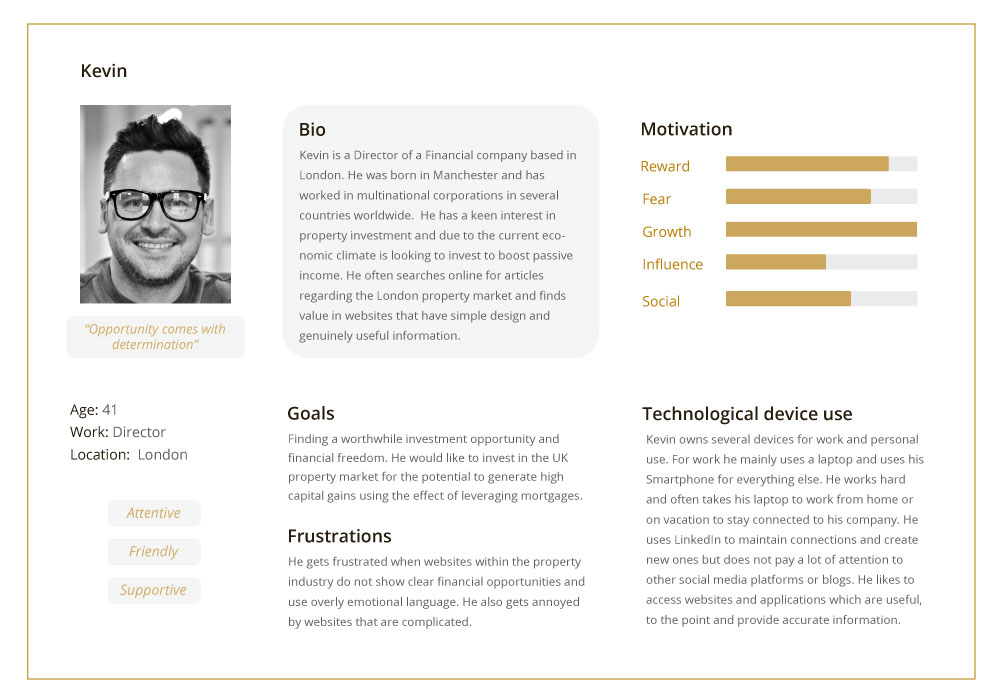
This persona was established based on qualitative user research conducted through a questionnaire with professionals who have experience or interest in investing in property. It represents an investor residing in London who would be a typical user of the website.
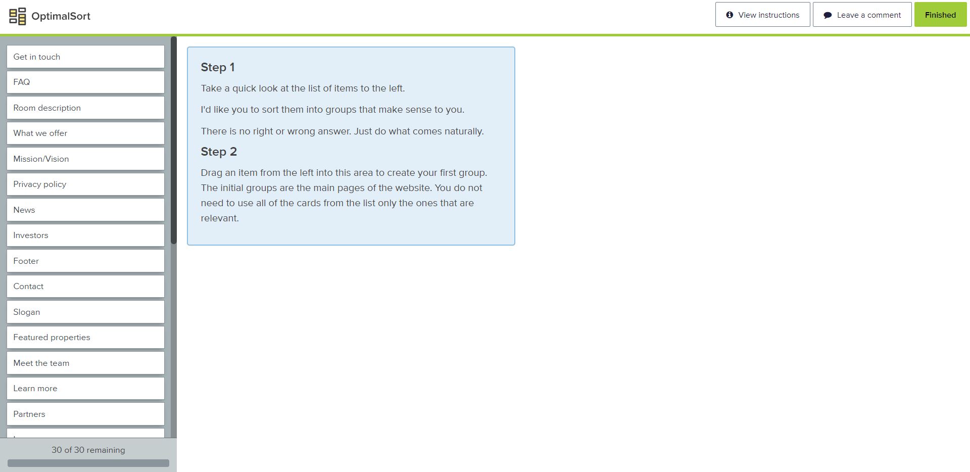
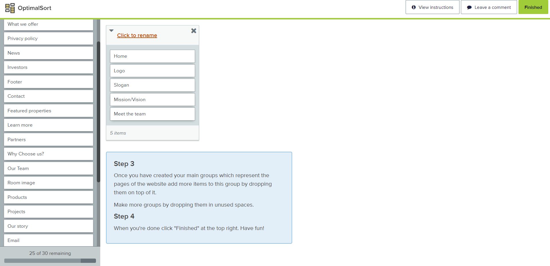
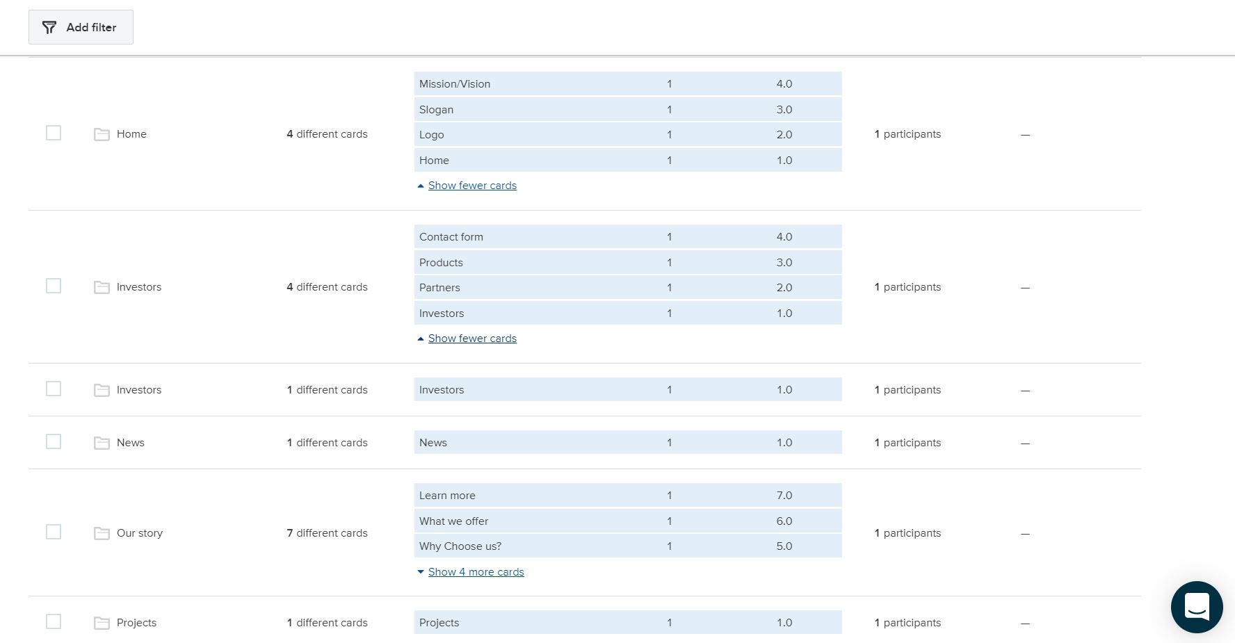
To help the company establish a clear structure to their website I conducted a card sorting activity using optimal sort. I used key words from a questionnaire conducted with the founders to create cards and enabled them to do an open card sort to group these into possible pages. Once the card sort was conducted I used the results to establish the main pages and structure of the site.
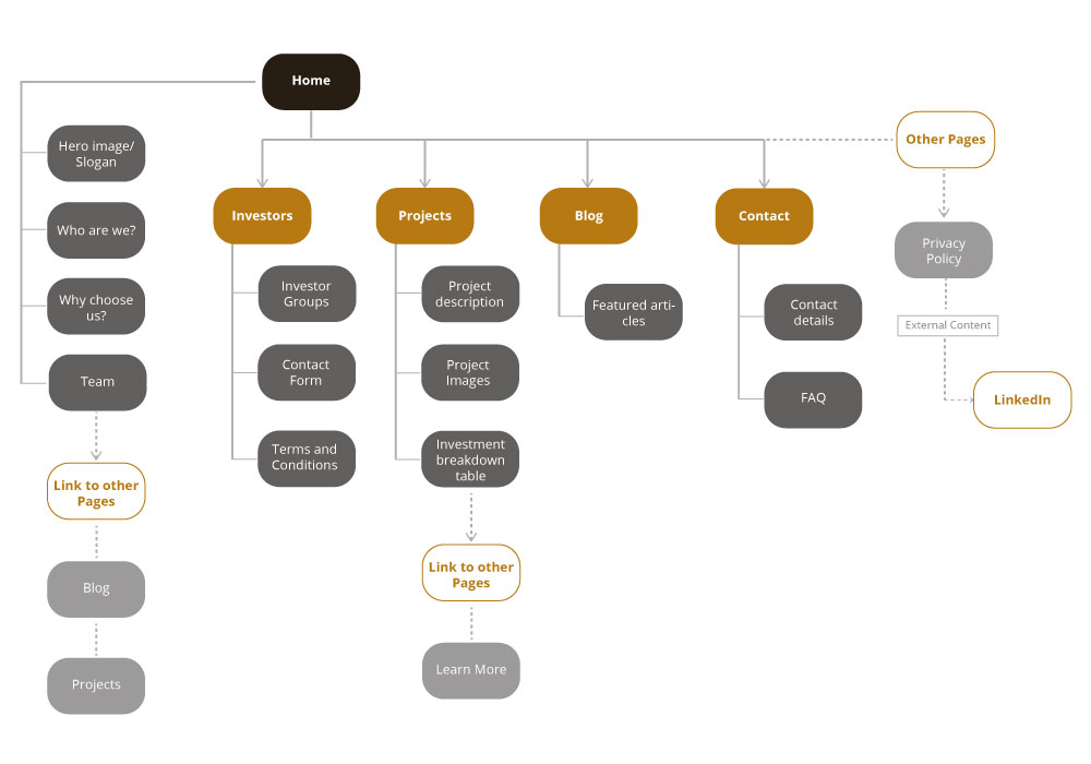
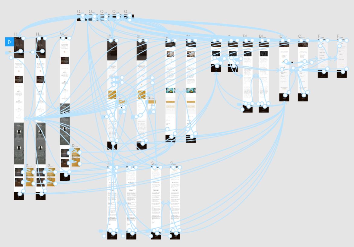
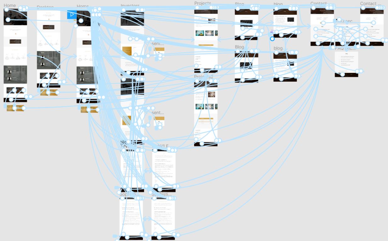
The system map was established after the card sorting exercise was completed. The founders had different ideas of what the structure of the site should look like in particular the main pages in the navigation menu. I combined the ideas from the card sort and created a system map. This was re-iterated after consultation with the founders to develop the most appropriate structure based on their needs. Below is the final system map after being revised several times.
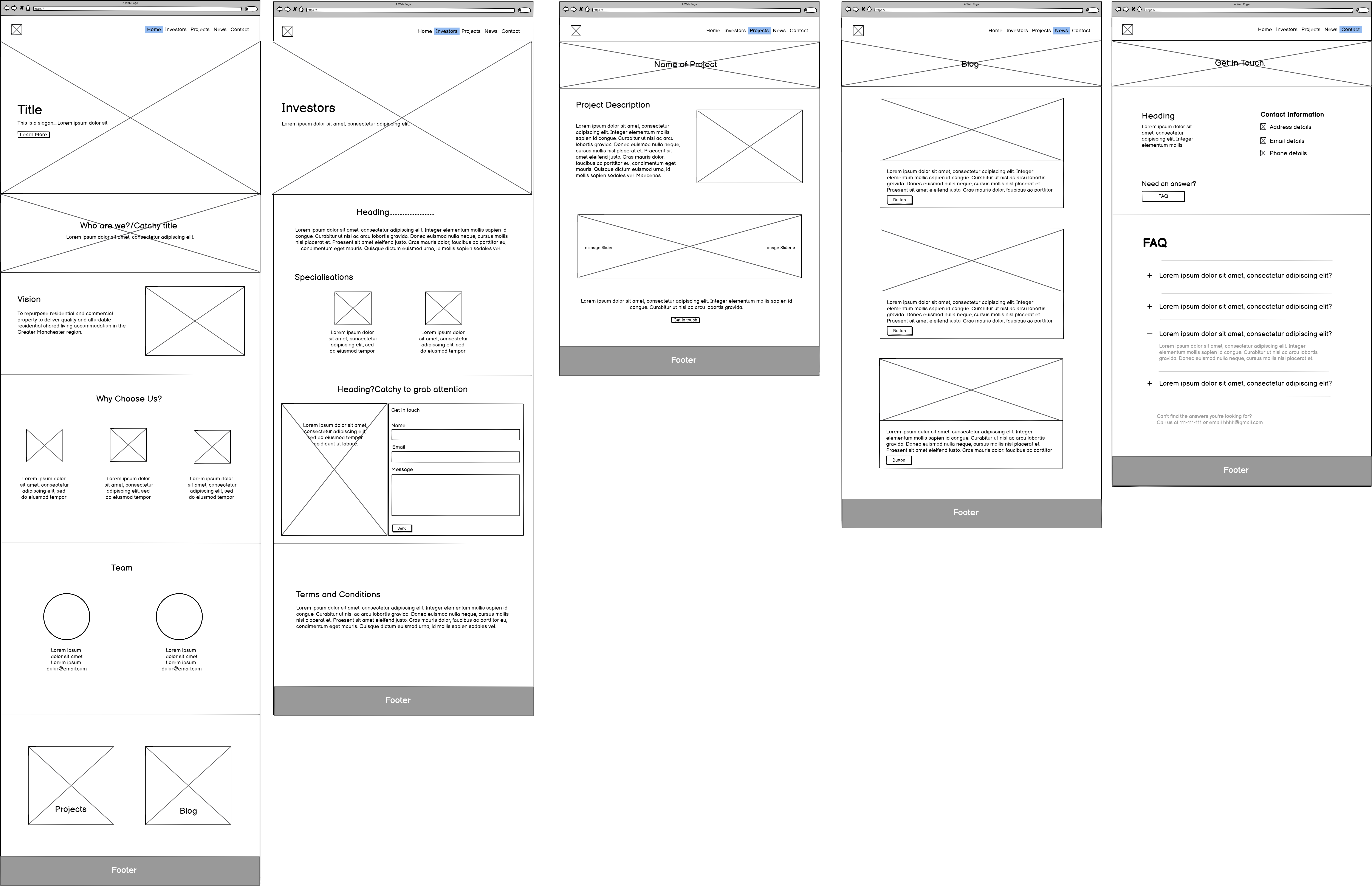
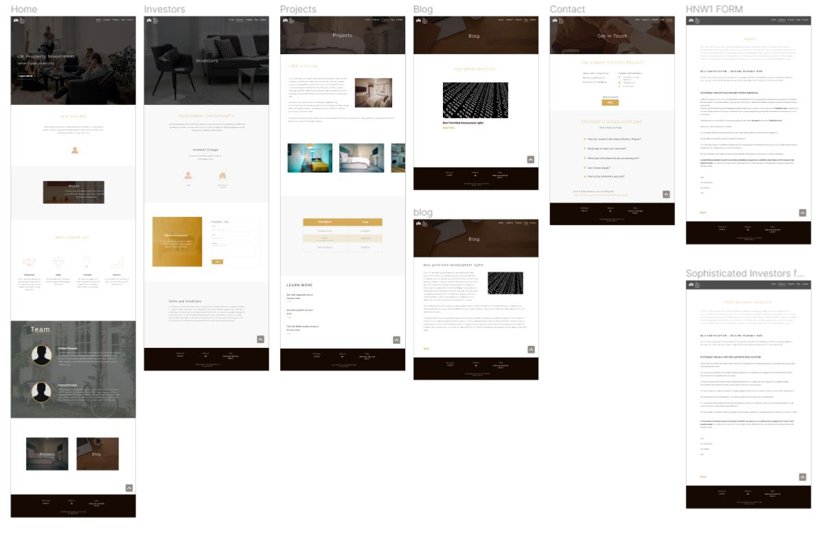
The wireframes were created using balsamiq after the card sorting was conducted and system map developed.
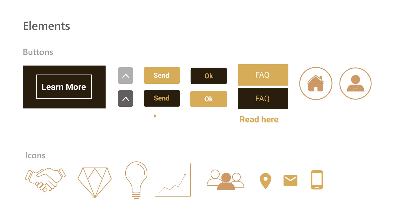
Software – Figma, Illustrator and Photoshop.
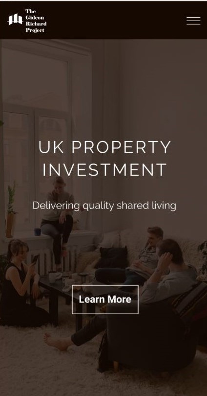
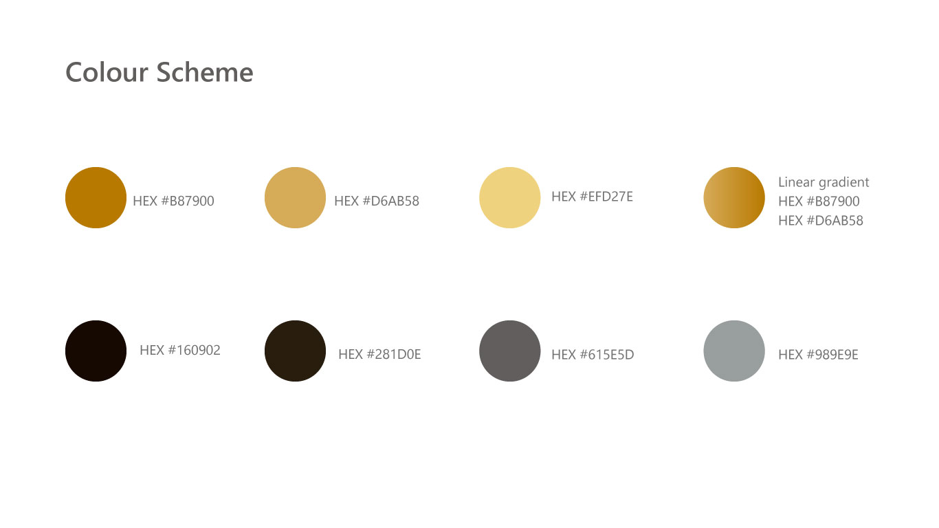
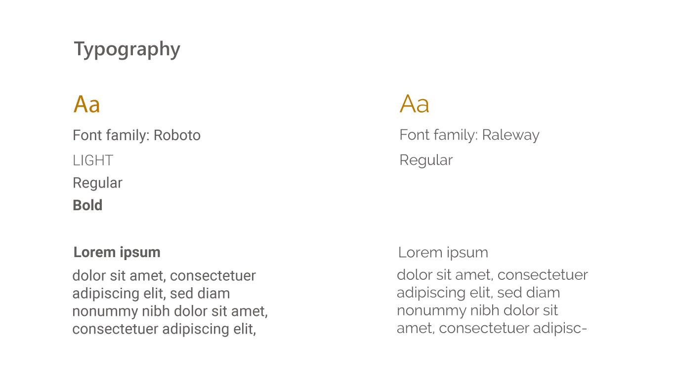
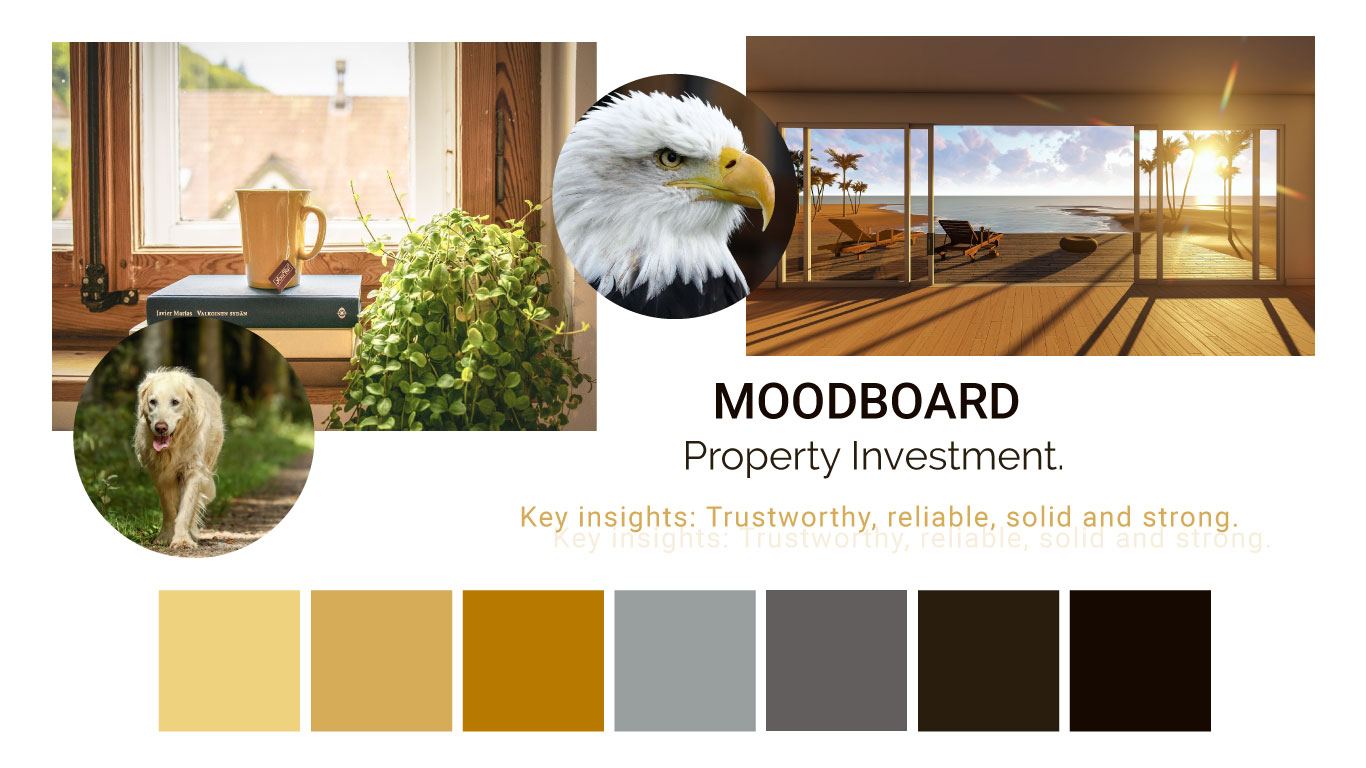
The visual design needed to reflect the insights identified by the client in the contextual analysis. The founders specified that they wanted the colours to be 'trustworthy, solid, and strong'. I did some research looking at colour theory and the psychology of colour to find a scheme that best represented the client's needs. Initially, I had a colour scheme consisting of earth colours and blues, but it made the site feel dark and uninviting. I decided to create a mood board with images reflecting the insights and based my colour scheme on this. The fonts 'Raleway' and 'Roboto' were chosen, as they have a modern and professional feel and make a good combination.
Images in the prototype were taken by: Slawomir Rydza and were provided by the company.
Software – Figma
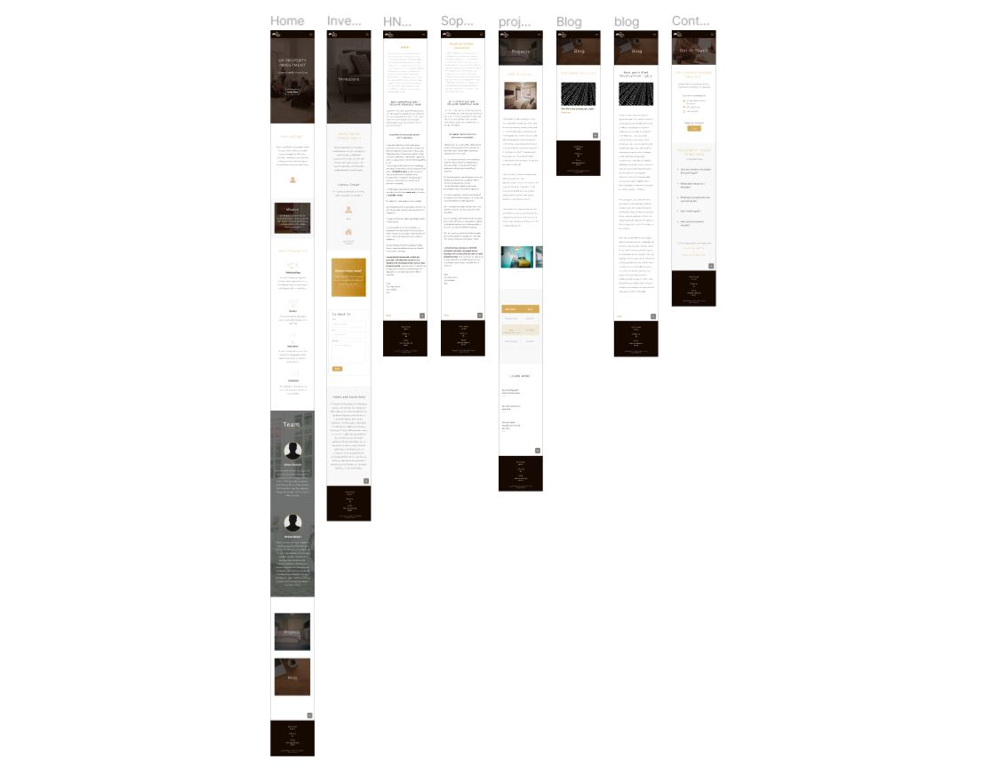
After several iterations and user testing and online questionnaire of the High-fidelity prototype the final prototype of both the desktop and mobile version are featured here. The user testing was conducted with 10 participants where they had to complete a set of tasks allocated. Once the participants completed the tasks they were then given a feedback questionnaire. The questionnaire enabled the participants to focus on what they experienced during the testing.
The project was completed over two months and gave me the opportunity to use a variety of design tools that I hadn’t used in previous projects, as I wanted to extend my skills. The project was conducted remotely, and communication channels were established by email and video call. I was the sole designer of the project, so it was an excellent opportunity to take ownership of the design process. I was able to apply my skills to establish a brief for the client, conduct research to inform my decisions, and apply my graphic, UI and UX design skills using a range of software.
Once the high-fidelity prototype was completed and a meeting was set up with the founders to make changes based on their feedback I conducted user testing. The feedback from the user testing was very positive with users providing feedback that they believed the colour scheme was effective, the site was professional and well suited to the industry and the design was simple and easy to use. Constructive feedback was also provided and this included:
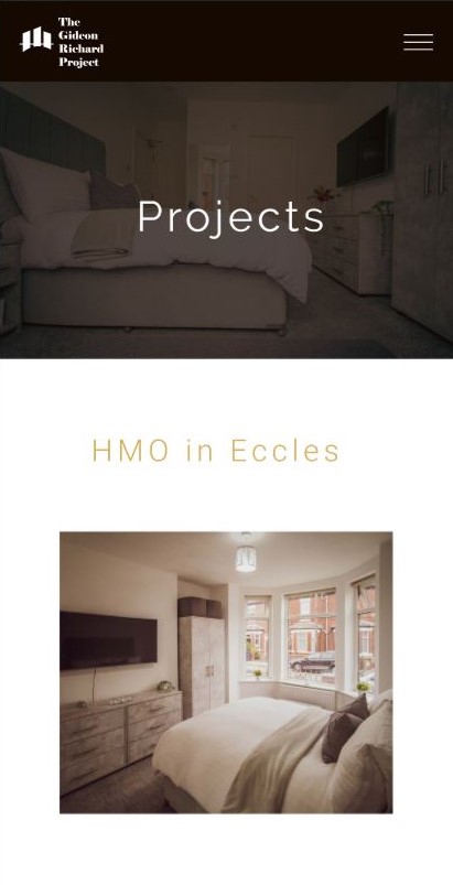
To address these I looked at the problems that could be easily solved in the next iteration. I first addressed the visibility of the icons on the home page and using illustrator I changed the stroke to a higher value. This improved accessbility for those who find it difficulty to see light images on mobile screens. In the next iteration additional photos would be added to the projects page. As the company is fairly new and it is their first website testimonials and sponsors will be apart of the future design as the company progresses. The images of the founders had not been provided during the design phase but it was their intention to provide these when the website was developed.
I was able to really extend my prototyping skills in this project as I had a lot of freedom to make design decisions. My approach was minimalistic and sleek and was applied to information architecture, the colour scheme and the font choice. The feedback for the high fidelity prototype was positive and overall users felt the website reflected the clients objectives.
The client hired a web developer to implement my designs and create the website. Since then, updates have been made to the site, including the addition of extra pages. But the visual design components including colour scheme, typography and graphical icons remain.
The live website can be viewed here.